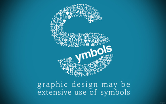
If you look really closely, you'll notice that not only is the design (which is a number 2) made up of numbers, but, the background is too.
Think of the time it took to make this....
Symbols, Symbols, everywhere...
Saw this on another blog & thought it was kind of neat.
Friday, October 5, 2012
These images are from Si Scott Studios. I really like the way that the swirls and lines all combine to become different animals, insects, fish, etc. They are very fascinating to me visually.
I really liked the way the text was set on the curve & the way it was done to give depth to the image. Also, I thought that it was very interesting in the way you couldn't read the entire thing straight across, you had to read in all different directions. I hope you enjoy it.
Thursday, October 4, 2012
I really liked the way the word "Typography is done here. It draws my attention & has me wanting to know what happened or what is going to happen.
Sunday, September 30, 2012
This reminded me of the posters we just did for Typography class. I thought it was kind of neat so I thought I would share...
This is kind of a typographic "explanation" poster. I loved the slight design humor.
I thought this was pretty neat considering it was all hand done & drawn with chalk. It shows how different styles of "type" can work well together.
This one is just thought was pretty darn funny! The fact that they put the poster up on a fence & pulled the vines through (that is if it isn't simply a photoshop job) I found to be pretty ingenious.